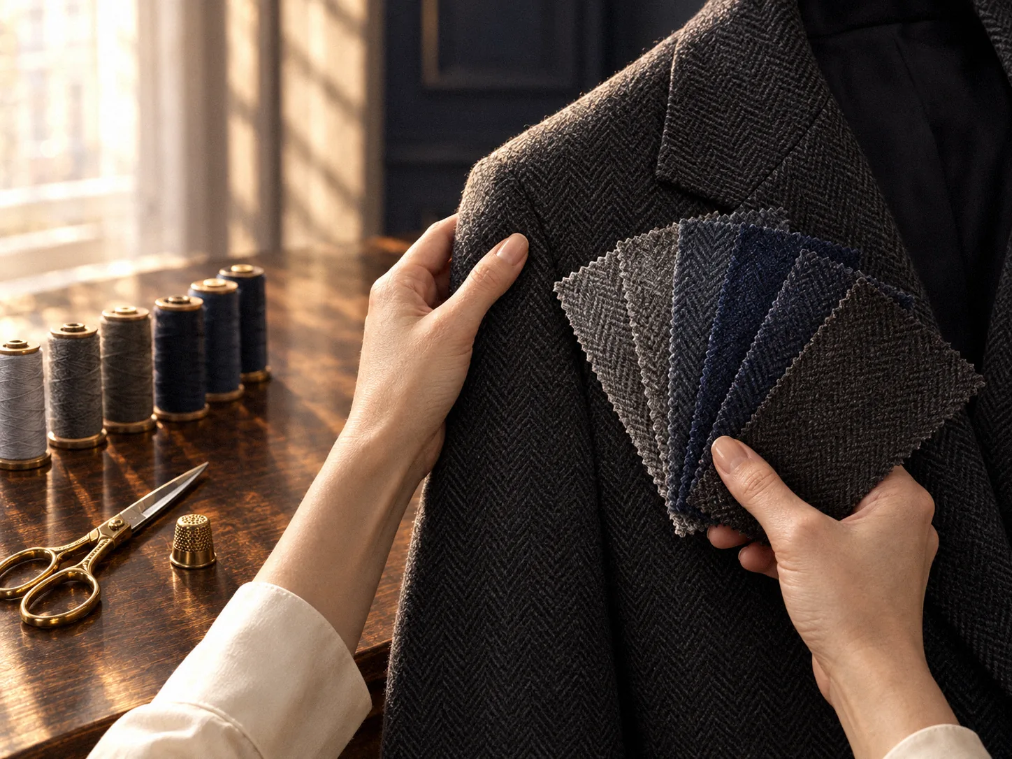
Why the same colour can “jump” off the garment
Sometimes a client brings her own piece of cloth, almost identical in colour to the jacket, and asks why I am still shaking my head.
Because what the eye sees is colour, sheen, texture and shadow added together. Satin reflects more light and reads lighter; plain cloth absorbs it and the same dye reads darker. A slightly longer pile scatters light and softens the tone; a tighter twist makes a smoother surface and hardens it. Same colour, different texture: the patch may pass under indoor light and then jump out the moment you step into the sun.
So our order is texture first, colour second. The other way round almost always fails.
Step one: weave and density
With a garment that needs new material, the first thing I look at is the weave: plain, twill, herringbone, satin, jacquard; in knits, plain, rib or patterned. Then I count density: how many warp and weft threads to the centimetre, or stitches and rows. These numbers decide whether the new cloth will “breathe” with the original, shrink at a similar rate when cleaned, and hang with the same weight.
The ideal, of course, is the garment's own spare cloth. Some designer pieces carry a small square in the inside pocket; some brands can supply it through their boutiques. Failing that, I look at the least visible parts of the garment, the inside facing or the turned hem, to see whether a small piece can be borrowed.
Step two: sheen and twist
Once the weave is right, we look at sheen. I set the swatch and the garment by the window and turn them through different angles to see whether they reflect light in the same way. Silk, wool, cotton and synthetics each have their own character under light; a small shift in a blend changes it. Twist matters too: the tighter the yarn is spun, the smoother and harder the surface; the looser, the softer and more absorbent.
There is no shortcut here, only eyes and time. But this is what decides whether the patch is recognised in different light.
Step three: thread colour and stitch length
Thread colour comes last. For an invisible repair I usually choose a thread one shade darker than the cloth, because thread on the surface catches the light and a shade darker reads as just right. Its weight should be close to the original yarn: too heavy and it stands proud, too fine and it will not hold. Stitch length follows the original: fine and close for invisible work, the original spacing and a visible colour for decorative topstitching.
When the colour is truly a shade off: softening the transition
Sometimes the nearest swatch is still half a shade off. Then I consider three approaches: a test wash in an inconspicuous place to see whether the two move closer after cleaning; a very fine local fade or dye along the border to create a gradient; or hiding the join on one of the garment's own structural lines, a pocket edge, a dart, a side seam, and letting the line absorb that half shade.
Each of these is tested on the garment first. We make a small trial repair, look, wash, and look again. That is the studio's real matching process.
Care changes the answer
Matching is not a single moment. The original has been worn for years and cleaned dozens of times; its colour and hand have moved. The new material is new. So I ask how you usually clean it, how often you wear it, whether it sees the sun. On a garment worn often and dry-cleaned regularly, the new cloth slowly catches up with the old; on one rarely worn, the difference stays.
Where the studio draws the line
Sheen, twist and the marks of past washing all affect the match; the final consistency of colour and texture can only be confirmed by a test repair on the garment. We do not promise “completely invisible” before that test.